

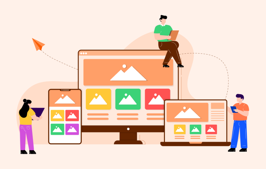
We can’t stress enough how important it is for websites to be mobile-friendly. Smartphones and tablets are quickly becoming the most popular ways to browse, shop, and do research online. This means that companies can’t ignore mobile users any longer. When you use responsive design, your website will automatically change to fit different screen sizes, so all users, no matter what device they’re using, will have the best experience possible.
If your site isn’t responsive, you could lose visitors, sales, and credibility. It’s no longer a choice to have responsive design—it’s necessary for the success of your business.
1. Mobile use is becoming more and more popular
- More than 60% of web traffic comes from phones.
- 77% of mobile searches happen at home or work, even when desktops are available.
- 72.9% of all online sales come from mobile commerce (m-commerce).
- 90% of smartphone users search or browse daily.
- Users leave non-mobile-friendly websites 68% faster.
This information shows that users’ behavior has changed in a big way. Many people will not visit your website if it is not mobile-friendly.
What Users Expect
People expect websites to load quickly and look great on mobile screens. Non-responsive sites frustrate users and push them to competitors.
2. Better experience for the user
With responsive design, the goal is to provide a smooth and consistent experience on all devices.
Pros of Better UX:
- Better navigation (no zooming or horizontal scrolling).
- Improved readability (text, images, and buttons fit).
- More engaged users are more likely to explore and buy.
Example: A responsive e-commerce store ensures products are visible, purchase buttons are easy to reach, and checkout is smooth.
ALSO READ: The Ultimate Guide to Web Development for Beginners
3. Google gives mobile-friendly websites more weight
With mobile-first indexing, Google ranks sites based on their mobile version.
Why it matters:
- SEO advantage → Higher rankings.
- Lower bounce rates → Better user experience.
- Avoid penalties → Non-mobile sites may be downgraded.
Responsive design improves your chances of ranking higher in Google.
4. Higher rates of conversion
Responsive design removes barriers to actions like:
- Filling contact forms
- Signing up for newsletters
- Shopping for products
- Requesting quotes
Key stats:
- 61% of users won’t return to a site if it’s hard to use on mobile.
- 40% will go to a competitor instead.
- Mobile-friendly websites see 20–30% more sales.
- 79% of users are more likely to return if the site works well on their phone.
A smooth mobile experience builds trust and increases sales.
5. Value for money
One responsive website replaces separate desktop and mobile sites.
Benefits:
- Lower development costs
- Less maintenance
- Adaptability to new devices
- Up to 50% savings on maintenance
Investing in responsive design saves money long-term.
6. Increased trust in the brand
Your website is often the first impression of your business.
Why responsive design builds trust:
- Professionalism: Shows you’re modern and user-focused.
- Consistency: Same brand look across all devices.
- Competitive edge: A polished site keeps customers from leaving for competitors.
7. Better integration of social networks
91% of social media traffic comes from mobile devices.
Responsive design ensures:
- Faster loading from social links
- Easier sharing and interaction
- Improved social-driven engagement
8. Getting used to new technology
Responsive design future-proofs your website.
Examples:
- Wearable tech compatibility (smartwatches).
- Voice search optimization.
- 7.49 billion global mobile users by 2025.
Responsive design ensures your website adapts to new devices and trends.
The Last Words on Responsive Design
Companies that want to succeed online must use responsive design.
It improves user experience, SEO rankings, conversions, brand trust, and future readiness.
Now is the time to make your website mobile-friendly to stay relevant and competitive.

